Built-in Components
In React, a component represents an independent and reusable piece of code that constructs the UI.
React Native Components
React Native is a framework for developing mobile applications, building on the concepts of React while offering components specialized for mobile. The basic React Native components are as follows.
1. View
View is one of the most basic components in React Native, serving as a building block for UI. It plays a role similar to the <div> tag in web, UIView in iOS, and ViewGroup in Android.
Key Features
-
Container: The
Viewcan act as a container, grouping other components together, playing a vital role in constructing layouts. -
Styling: The
Viewcomponent can be styled using thestyleprop. This includes applying styles like background color, padding, margin, borders, and more. -
Touch Events: The
Viewcan respond to user touch events. For instance, it can detect and respond to user taps, swipes, etc. -
Accessibility: The
Viewsupports accessibility features, helping provide information to assistive technologies like screen readers. -
Layout: React Native employs the Flexbox layout. The
Viewcomponent fully supports all Flexbox properties, making it versatile for constructing complex UI layouts.
Usage Example
import React from 'react';
import {View, Text} from 'react-native';

const ViewBoxesWithColorAndText = () => {
  return (
    <View
      style={{
        flexDirection: 'row',
        height: 100,
        padding: 20,
      }}>
      <View style={{backgroundColor: 'blue', flex: 0.3}} />
      <View style={{backgroundColor: 'red', flex: 0.5}} />
      <Text>Hello World!</Text>
    </View>
  );
};

export default ViewBoxesWithColorAndText;
The main features of the given code are as follows.
-
Imports:
Reactis imported to access the React library.ViewandTextare UI components imported from the React Native library. TheViewgenerally serves as a container, whileTextdisplays text.
-
ViewBoxesWithColorAndText Component:
- This component consists of a
Viewcontaining three child elements.
- This component consists of a
-
Outer View Style:
flexDirection: 'row': Aligns child elements horizontally.height: 100: The height of this View is 100 pixels.padding: 20: Adds padding of 20 pixels on all sides of this View.
-
Child Elements:
- The first
View: Has a blue background and occupies 30% of the parentView's width (flex: 0.3). - The second
View: Has a red background and occupies 50% of the parentView's width (flex: 0.5). Text: Displays the text "Hello World!".
- The first
-
Export:
export default ViewBoxesWithColorAndText;allows this component to be imported and used in other files.
Based on the description above, when this component is displayed on the screen, you will see two boxes of different colors and the text "Hello World!" aligned horizontally.
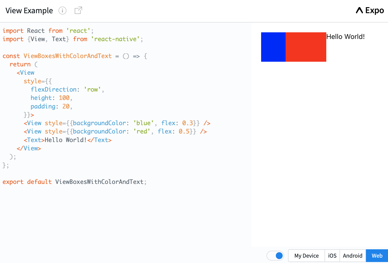
Click on the picture to run the example code.
2. Text
Text is a key component in React Native, used to display text on the screen. It functions similarly to the <span> or <p> tags in web.
Key Features
-
Displaying Text: The
Textcomponent is used to convey textual information to the user. -
Styling: Just like the
View, theTextcomponent can be styled using thestyleprop. It supports a range of text-styling properties like font size, font color, weight (boldness), text alignment, and more. -
Nesting: The
Textcomponent can be nested, meaning oneTextcomponent can contain another. This allows for complex styling, where certain segments of text can have distinct styles. -
Touch Events: Touch events can also be applied to the
Textcomponent, defining behaviors like what happens when the text is tapped. -
Text-Specific Properties: You can set text-specific properties like line height, letter spacing, ellipsis (text truncation), and more.
Usage Example
import React, {useState} from 'react';
import {Text, StyleSheet} from 'react-native';

const TextInANest = () => {
  const [titleText, setTitleText] = useState("Bird's Nest");
  const bodyText = 'This is not really a bird nest.';

  const onPressTitle = () => {
    setTitleText("Bird's Nest [pressed]");
  };

  return (
    <Text style={styles.baseText}>
      <Text style={styles.titleText} onPress={onPressTitle}>
        {titleText}
        {'\n'}
        {'\n'}
      </Text>
      <Text numberOfLines={5}>{bodyText}</Text>
    </Text>
  );
};

const styles = StyleSheet.create({
  baseText: {
    fontFamily: 'Cochin',
  },
  titleText: {
    fontSize: 20,
    fontWeight: 'bold',
  },
});

export default TextInANest;
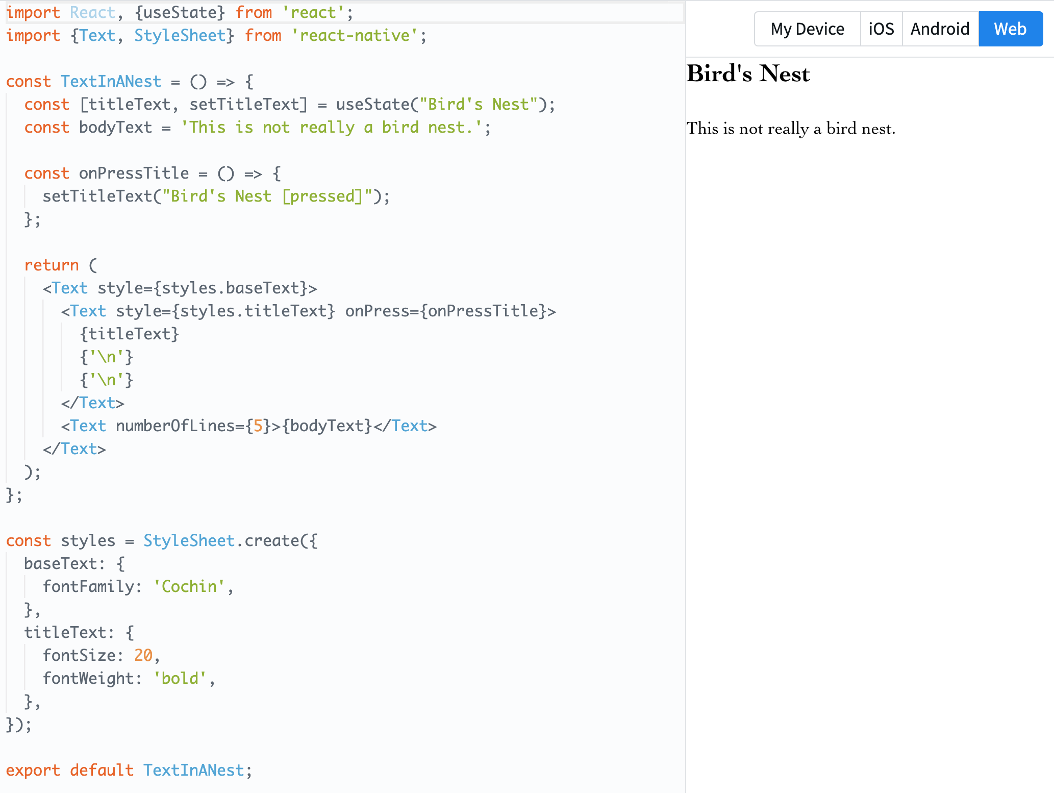
Click on the image to run the example code.
Code Explanation
-
Imports
import React, {useState} from 'react';
import {Text, StyleSheet} from 'react-native';- Import React and React's
useStatehook. - Import
Textcomponent andStyleSheetobject from React Native.
- Import React and React's
-
TextInANest Component This component consists of 2 text elements.
-
Initialize
titleTextstate variable and its setter functionsetTitleTextusinguseState. The initial value is"Bird's Nest". -
bodyTextis a constant variable with the value set to"This is not really a bird nest.". -
onPressTitlefunction updates the value oftitleTextto"Bird's Nest [pressed]". It's triggered when the title text is tapped. -
In the
returnstatement, twoTextcomponents are nested inside a parentTextcomponent. The nested structure allows for inheriting styles and other attributes. -
The first nested
Textcomponent displays the title and when pressed, triggers theonPressTitlefunction. -
The second nested
Textcomponent displays the value ofbodyText. It is configured to show a maximum of 5 lines using thenumberOfLinesprop.
-
-
Styles
const styles = StyleSheet.create({
  baseText: {
    fontFamily: 'Cochin',
  },
  titleText: {
    fontSize: 20,
    fontWeight: 'bold',
  },
});- Define styles using the
StyleSheet.createmethod. baseTextstyle sets the font to 'Cochin'.titleTextstyle sets the font size to 20 and displays the text in bold.
- Define styles using the
-
Export
export default TextInANest;- Set
TextInANestcomponent as the default export so it can be imported and used in other files.
- Set
3. Image
The Image is a fundamental component in React Native for displaying images. Using this component, you can display both static images included in the app and images fetched from an external URL.
Key Features
-
Source Type: The
Imagecomponent supports various types of image sources. This can be an image imported locally viarequireor fetched through a web URL. -
Styling: The
Imagecan also be styled using thestyleprop. Through this, you can set styles such as image size, rounded corners, and borders. -
Resizing: You can specify the resizing mode of the image using the
resizeModeprop. For instance, values include 'cover', 'contain', 'stretch', 'repeat', and 'center'. -
Event Handling: The
Imagecomponent offers callbacks for various events, such as image load completion and load failure. -
Fade-in Effect: The
fadeDurationprop allows you to set the duration of the fade-in effect when the image is displayed on the screen (Android exclusive).
Usage Example
import React from 'react';
import {View, Image, StyleSheet} from 'react-native';

const styles = StyleSheet.create({
  container: {
    paddingTop: 50
  },
  tinyLogo: {
    width: 50,
    height: 50,
  },
});

const DisplayAnImage = () => {
  return (
    <View style={styles.container}>
      <Image
        style={styles.tinyLogo}
        source={require('@expo/snack-static/react-native-logo.png')}
      />
      <Image
        style={styles.tinyLogo}
        source={{
          uri: 'https://reactnative.dev/img/tiny_logo.png',
        }}
      />
    </View>
  );
};

export default DisplayAnImage;
Click on the picture to run the example code.
The code defines a simple component in React Native to display images on the screen.
-
Imports
import React from 'react';
import {View, Image, StyleSheet} from 'react-native';- Imports the React library.
- Imports
View,Image, andStyleSheetfrom React Native.
-
Styles
const styles = StyleSheet.create({
  container: {
    paddingTop: 50
  },
  tinyLogo: {
    width: 50,
    height: 50,
  },
});- Styles are defined using the
StyleSheet.createmethod. containerhas a padding top of 50.tinyLogodefines the image size to be 50x50.
- Styles are defined using the
-
DisplayAnImage Component
- Contains two
Imagecomponents inside aViewcomponent. - The first
Imagecomponent displays an image from the local path, in this case,@expo/snack-static/react-native-logo.png. - The second
Imagecomponent displays an image fetched from a web URL, specificallyhttps://reactnative.dev/img/tiny_logo.png.
- Contains two
-
Export
export default DisplayAnImage;- The
DisplayAnImagecomponent is set as the default export, allowing it to be imported and used in other files.
- The
4. TextInput
TextInput is a core component in React Native for accepting user text input. It operates similarly to the web's <input type="text"> element, allowing users to enter or modify text.
Key Features
-
Text Input: Allows users to enter text through the keyboard.
-
Styling:
TextInputcan also be styled using thestyleprop. This enables specifying input field dimensions, borders, font style, and so on. -
Placeholder: The
placeholderprop can be used to offer guidance or examples of input to users. -
Value Control: Access or modify the current input value using the
valueprop. Additionally, theonChangeTextprop allows the execution of a callback function when the text changes. -
Keyboard Type: Using the
keyboardTypeprop, you can request to display a specific type of keyboard layout (e.g., 'numeric' for numbers only). -
Multiple Lines: Text input can accommodate multiple lines using the
multilineprop. -
Event Handling: Provides callback functions for various events. For instance, there's
onFocus,onBlur,onSubmitEditing, and others.
Usage Example
import React from 'react';
import {SafeAreaView, StyleSheet, TextInput} from 'react-native';

const TextInputExample = () => {
  const [text, onChangeText] = React.useState('Useless Text');
  const [number, onChangeNumber] = React.useState('');

  return (
    <SafeAreaView>
      <TextInput
        style={styles.input}
        onChangeText={onChangeText}
        value={text}
      />
      <TextInput
        style={styles.input}
        onChangeText={onChangeNumber}
        value={number}
        placeholder="useless placeholder"
        keyboardType="numeric"
      />
    </SafeAreaView>
  );
};

const styles = StyleSheet.create({
  input: {
    height: 40,
    margin: 12,
    borderWidth: 1,
    padding: 10,
  },
});

export default TextInputExample;
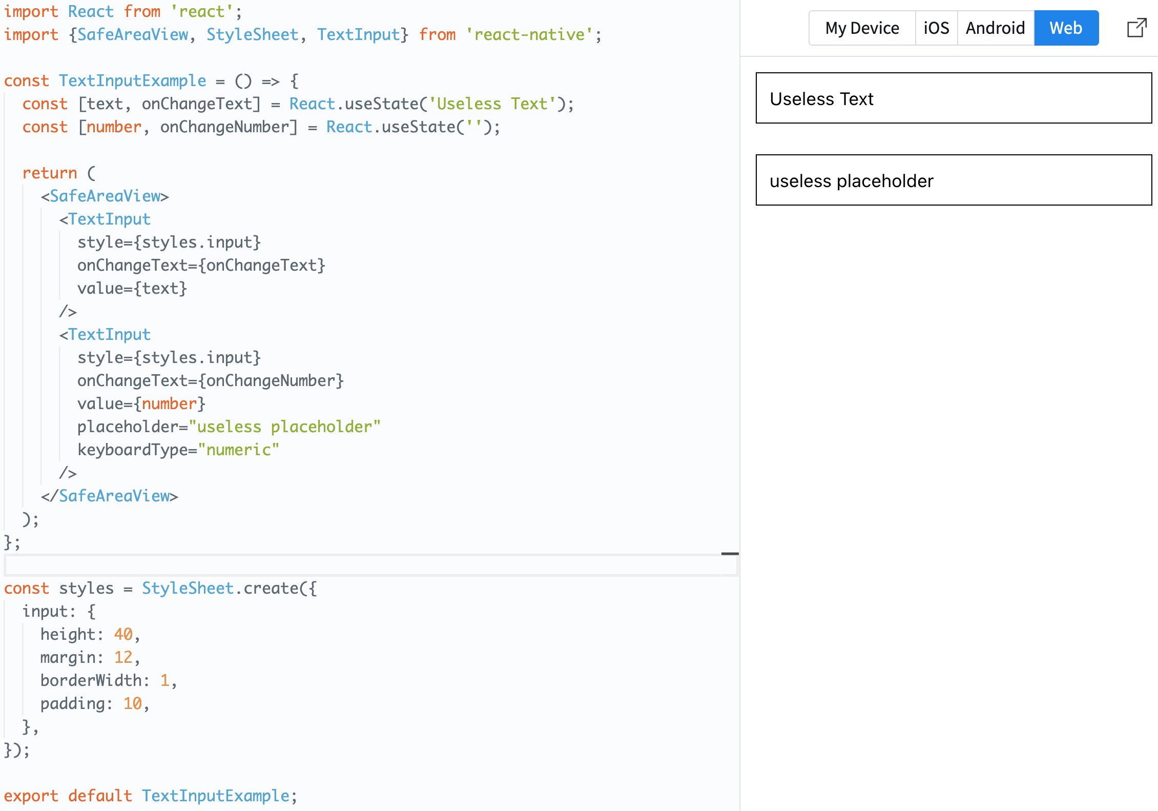
Click on the image to run the example code.
This code defines a component using React Native that displays two text input boxes on the screen.
-
Imports
import React from 'react';
import {SafeAreaView, StyleSheet, TextInput} from 'react-native';- This imports React and React Native's
SafeAreaView,StyleSheet, andTextInputcomponents.
- This imports React and React Native's
-
TextInputExample Component
- Using
useState, the text state variabletextand the number state variablenumberare initialized.textstarts with the value 'Useless Text'. onChangeTextupdates thetextstate, andonChangeNumberupdates thenumberstate.- Inside the
SafeAreaView, twoTextInputcomponents are returned.- The first
TextInputdisplays thetextvalue and updates the state usingonChangeTextwhen its value changes. - The second
TextInputdisplays thenumbervalue, updates its state usingonChangeNumberwhen the value changes, sets thekeyboardTypeattribute to "numeric" to display a numeric keyboard, and uses theplaceholderattribute to show the text "useless placeholder" when the input box is empty.
- The first
- Using
-
Styles
const styles = StyleSheet.create({
  input: {
    height: 40,
    margin: 12,
    borderWidth: 1,
    padding: 10,
  },
});- Input box styles are defined using the
StyleSheet.createmethod. The input box has a height of 40, margin of 12, border width of 1, and padding of 10.
- Input box styles are defined using the
-
Export
export default TextInputExample;- The
TextInputExamplecomponent is set as a default export, making it importable for use in other files.
- The
5. ScrollView
ScrollView is a basic component in React Native that, when the content exceeds the screen size, allows for scrolling to view the content. It's typically used to view components or lists that are larger than the screen size.
Key Features
-
Scrollable Container: Wraps content that exceeds the visible range of the screen, allowing users to scroll to see the entire content.
-
Direction: By default, it scrolls vertically. However, by setting the
horizontalprop totrue, you can make it scroll horizontally. -
Integrated Styling: The
ScrollViewcan also be styled using thestyleprop. -
Event Handling: It provides callback functions for various scroll events. For instance, there are
onScroll,onMomentumScrollStart,onMomentumScrollEnd, etc. -
Refresh Control: Through the
refreshControlprop, you can implement the pull-to-refresh feature. -
Performance: When displaying large lists or grids, it's better to use optimized components like
FlatListorSectionListrather thanScrollView.
Usage Example
import React from 'react';
import {
  StyleSheet,
  Text,
  SafeAreaView,
  ScrollView,
  StatusBar,
} from 'react-native';

const App = () => {
  return (
    <SafeAreaView style={styles.container}>
      <ScrollView style={styles.scrollView}>
        <Text style={styles.text}>
          Lorem ipsum dolor sit amet, consectetur adipiscing elit, sed do
          eiusmod tempor incididunt ut labore et dolore magna aliqua.
        </Text>
      </ScrollView>
    </SafeAreaView>
  );
};

const styles = StyleSheet.create({
  container: {
    flex: 1,
    paddingTop: StatusBar.currentHeight,
  },
  scrollView: {
    backgroundColor: 'pink',
    marginHorizontal: 20,
  },
  text: {
    fontSize: 42,
  },
});

export default App;
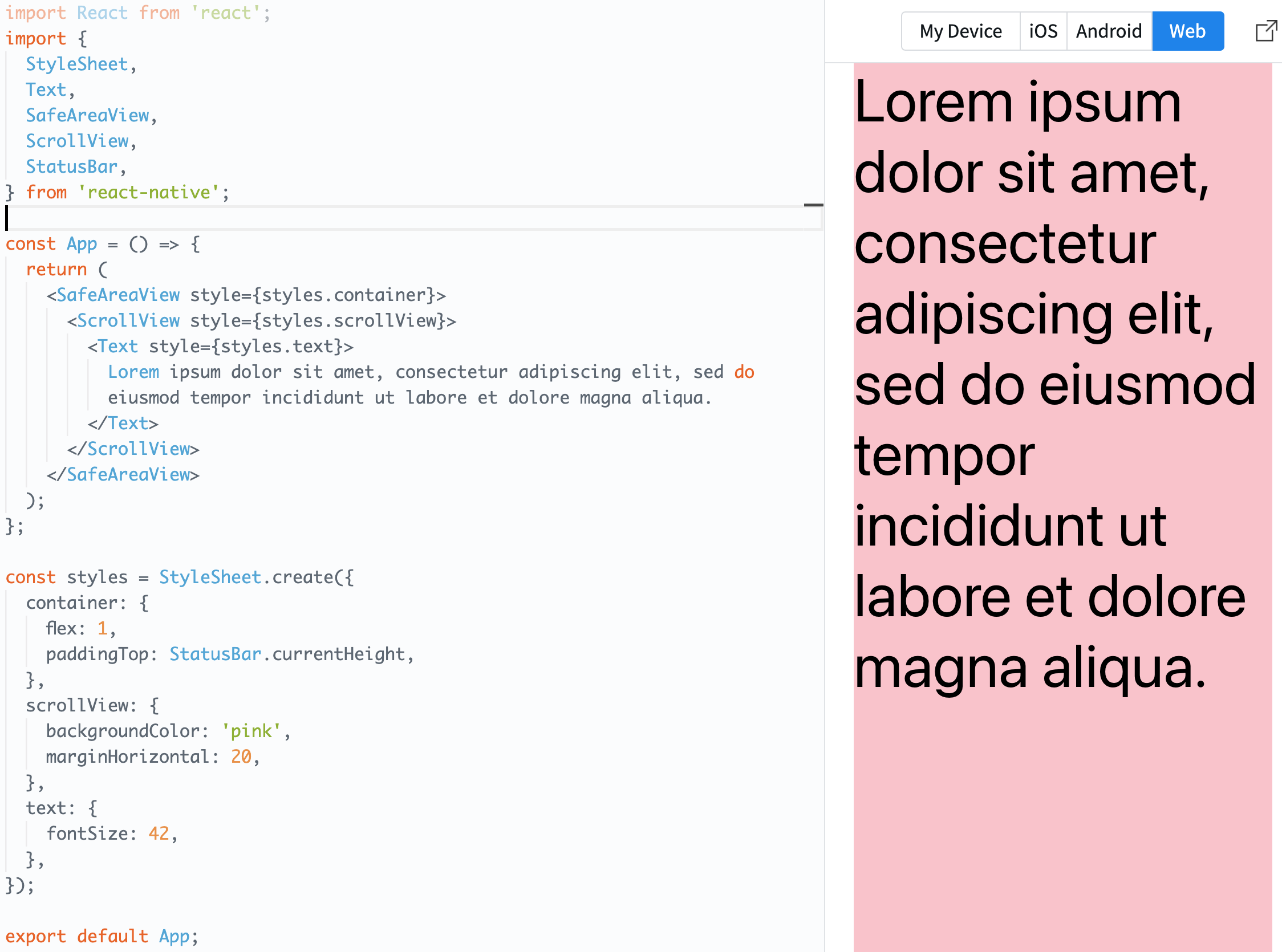
Click on the picture to execute the sample code.
This code describes a simple application using React Native that displays a scrollable text area.
-
Imports
import React from 'react';
import {
  StyleSheet,
  Text,
  SafeAreaView,
  ScrollView,
  StatusBar,
} from 'react-native';- It imports the necessary modules and components, namely
React,StyleSheet,Text,SafeAreaView,ScrollView, andStatusBarfrom React Native.
- It imports the necessary modules and components, namely
-
App Component
SafeAreaViewserves as the main container of the application. This container has padding at the top equal to the device's status bar height.ScrollViewprovides a scrollable area. In this example, aTextcomponent is placed inside theScrollViewto create a scrollable text area.- The
Textcomponent displays sample text like "Lorem ipsum...".
-
Styles
const styles = StyleSheet.create({
  container: {
    flex: 1,
    paddingTop: StatusBar.currentHeight,
  },
  scrollView: {
    backgroundColor: 'pink',
    marginHorizontal: 20,
  },
  text: {
    fontSize: 42,
  },
});- Styles are defined using the
StyleSheet.createmethod. - The
containerstyle is set to take up the entire screen (flex: 1) and has padding at the top equal to the height of the status bar. - The
scrollViewstyle sets the background color to 'pink' and has a horizontal margin of 20 on both sides. - The
textstyle sets the font size of the text to 42.
- Styles are defined using the
-
Export
export default App;- The
Appcomponent is set to default export so that it can be imported and used in other files.
- The
6. Button
Button is one of the user interface components provided by default in React Native, representing a button element that users can touch.
Key Features
- Simple Interface: The
Buttonoffers a straightforward API, primarily used to set a title and event handler. - Platform-Specific Styling: By default, the
Buttonadopts the native styling of the current platform (e.g., iOS, Android). - Limited Customization: The customization options for the
Buttoncomponent are limited. If you're looking for more advanced styling or features, you might want to consider other components or third-party libraries.
Usage Example
import React from 'react';
import {
  StyleSheet,
  Button,
  View,
  SafeAreaView,
  Text,
  Alert,
} from 'react-native';

const Separator = () => <View style={styles.separator} />;

const App = () => (
  <SafeAreaView style={styles.container}>
    <View>
      <Text style={styles.title}>
        The title and onPress handler are required. It is recommended to set
        accessibilityLabel to help make your app usable by everyone.
      </Text>
      <Button
        title="Press me"
        onPress={() => Alert.alert('Simple Button pressed')}
      />
    </View>
    <Separator />
    <View>
      <Text style={styles.title}>
        Adjust the color in a way that looks standard on each platform. On iOS,
        the color prop controls the color of the text. On Android, the color
        adjusts the background color of the button.
      </Text>
      <Button
        title="Press me"
        color="#f194ff"
        onPress={() => Alert.alert('Button with adjusted color pressed')}
      />
    </View>
    <Separator />
    <View>
      <Text style={styles.title}>
        All interaction for the component are disabled.
      </Text>
      <Button
        title="Press me"
        disabled
        onPress={() => Alert.alert('Cannot press this one')}
      />
    </View>
    <Separator />
    <View>
      <Text style={styles.title}>
        This layout strategy lets the title define the width of the button.
      </Text>
      <View style={styles.fixToText}>
        <Button
          title="Left button"
          onPress={() => Alert.alert('Left button pressed')}
        />
        <Button
          title="Right button"
          onPress={() => Alert.alert('Right button pressed')}
        />
      </View>
    </View>
  </SafeAreaView>
);

const styles = StyleSheet.create({
  container: {
    flex: 1,
    justifyContent: 'center',
    marginHorizontal: 16,
  },
  title: {
    textAlign: 'center',
    marginVertical: 8,
  },
  fixToText: {
    flexDirection: 'row',
    justifyContent: 'space-between',
  },
  separator: {
    marginVertical: 8,
    borderBottomColor: '#737373',
    borderBottomWidth: StyleSheet.hairlineWidth,
  },
});

export default App;
By clicking on the image, you can run and test the example code.
This code illustrates an application using React Native that displays buttons with various attributes on the screen.
-
Imports
import React from 'react';
import {
  StyleSheet,
  Button,
  View,
  SafeAreaView,
  Text,
  Alert,
} from 'react-native';
Here, the necessary modules and components are imported from React Native.
-
Separator Component
const Separator = () => <View style={styles.separator} />;This is a simple component to create vertical spacing and a separator line.
-
App Component This component contains multiple
Viewcontainers. Inside eachView, there's explanatoryTextand aButton.- The
first buttoncomes with default settings. - The
second buttonuses thecolorproperty to adjust its color. On iOS, this changes the color of the text, while on Android, it adjusts the button's background color. - The
third buttonis deactivated due to thedisabledproperty, hence, nothing happens when it's clicked. - The last
two buttonsare positioned side by side in the same row, which is achieved by setting theflexDirection: 'row'property via thestyles.fixToTextstyle.
- The
-
Styles
const styles = StyleSheet.create({ ... });This is where the styles of the application are defined. Each style controls the visual representation of the components.
- The
containerstyle centers the main container of the app. - The
titlestyle is applied to the title text of each section. fixToTextis used to place two buttons side by side in the same row.- The
separatorstyle defines the separator line distinguishing each section.
- The
-
Export
export default App;The
Appcomponent is set as the default export, allowing it to be imported and used in other files.
7. FlatList
FlatList is a component in React Native designed for efficiently displaying large sets of data. This component uses 'windowing' technology to optimize performance by rendering only the views that are currently visible on the screen.
Key Features
- Performance Optimization: Items that are not visible on the screen are not rendered, reducing rendering overhead.
- Pooling Technique: Previously rendered item views can be reused.
- Built-in Scrolling: Automatic scrolling functionality is integrated.
Usage Example
import React from 'react';
import {
  SafeAreaView,
  View,
  FlatList,
  StyleSheet,
  Text,
  StatusBar,
} from 'react-native';

const DATA = [
  {
    id: 'bd7acbea-c1b1-46c2-aed5-3ad53abb28ba',
    title: 'First Item',
  },
  {
    id: '3ac68afc-c605-48d3-a4f8-fbd91aa97f63',
    title: 'Second Item',
  },
  {
    id: '58694a0f-3da1-471f-bd96-145571e29d72',
    title: 'Third Item',
  },
];

type ItemProps = {title: string};

const Item = ({title}: ItemProps) => (
  <View style={styles.item}>
    <Text style={styles.title}>{title}</Text>
  </View>
);

const App = () => {
  return (
    <SafeAreaView style={styles.container}>
      <FlatList
        data={DATA}
        renderItem={({item}) => <Item title={item.title} />}
        keyExtractor={item => item.id}
      />
    </SafeAreaView>
  );
};

const styles = StyleSheet.create({
  container: {
    flex: 1,
    marginTop: StatusBar.currentHeight || 0,
  },
  item: {
    backgroundColor: '#f9c2ff',
    padding: 20,
    marginVertical: 8,
    marginHorizontal: 16,
  },
  title: {
    fontSize: 32,
  },
});

export default App;
By clicking on the image, you can run and test the example code.
This code demonstrates an example of creating a simple list view using React Native. Let's break down the key sections:
-
Imports
import React from 'react';
import {
  SafeAreaView,
  View,
  FlatList,
  StyleSheet,
  Text,
  StatusBar,
} from 'react-native';
Here, the necessary components and modules from React Native are imported for constructing the app.
-
DATA Constant
const DATA = [ ... ];This is an array of data to be displayed in the list view. Each item has a unique
idandtitle. -
ItemProps Type
type ItemProps = {title: string};Using TypeScript, the type for the
propsof theItemcomponent is defined. Here, it includes only atitleproperty which is a string. -
Item Component
const Item = ({title}: ItemProps) => ( ... );This is a component for displaying individual list items. It contains a
Textcomponent with a background color, padding, and text style. -
App Component
const App = () => { ... };This is the main component of the app. It uses the
FlatListcomponent to display the items from theDATAarray.- The
dataprop specifies the data to be displayed. - The
renderItemprop defines how each item will be rendered. - The
keyExtractorprop specifies a function to extract a unique key for each item. Here, theidof each item is used.
- The
-
Styles
const styles = StyleSheet.create({ ... });This section defines the styles for the application. Styles for the container, item, and title are defined here.
-
Export
export default App;The
Appcomponent is set as the default export, allowing it to be imported and used in other files.
8. SectionList
SectionList is a component that displays list data with section headers. Like FlatList, it offers performance optimization features, but it allows data to be displayed in distinct sections.
Key Features
- Section Display: Displays data divided into multiple sections.
- Section Headers: Provides headers at the beginning of each section.
Usage Example
import React from 'react';
import {
  StyleSheet,
  Text,
  View,
  SafeAreaView,
  SectionList,
  StatusBar,
} from 'react-native';

const DATA = [
  {
    title: 'Main dishes',
    data: ['Pizza', 'Burger', 'Risotto'],
  },
  {
    title: 'Sides',
    data: ['French Fries', 'Onion Rings', 'Fried Shrimps'],
  },
  {
    title: 'Drinks',
    data: ['Water', 'Coke', 'Beer'],
  },
  {
    title: 'Desserts',
    data: ['Cheese Cake', 'Ice Cream'],
  },
];

const App = () => (
  <SafeAreaView style={styles.container}>
    <SectionList
      sections={DATA}
      keyExtractor={(item, index) => item + index}
      renderItem={({item}) => (
        <View style={styles.item}>
          <Text style={styles.title}>{item}</Text>
        </View>
      )}
      renderSectionHeader={({section: {title}}) => (
        <Text style={styles.header}>{title}</Text>
      )}
    />
  </SafeAreaView>
);

const styles = StyleSheet.create({
  container: {
    flex: 1,
    paddingTop: StatusBar.currentHeight,
    marginHorizontal: 16,
  },
  item: {
    backgroundColor: '#f9c2ff',
    padding: 20,
    marginVertical: 8,
  },
  header: {
    fontSize: 32,
    backgroundColor: '#fff',
  },
  title: {
    fontSize: 24,
  },
});

export default App;
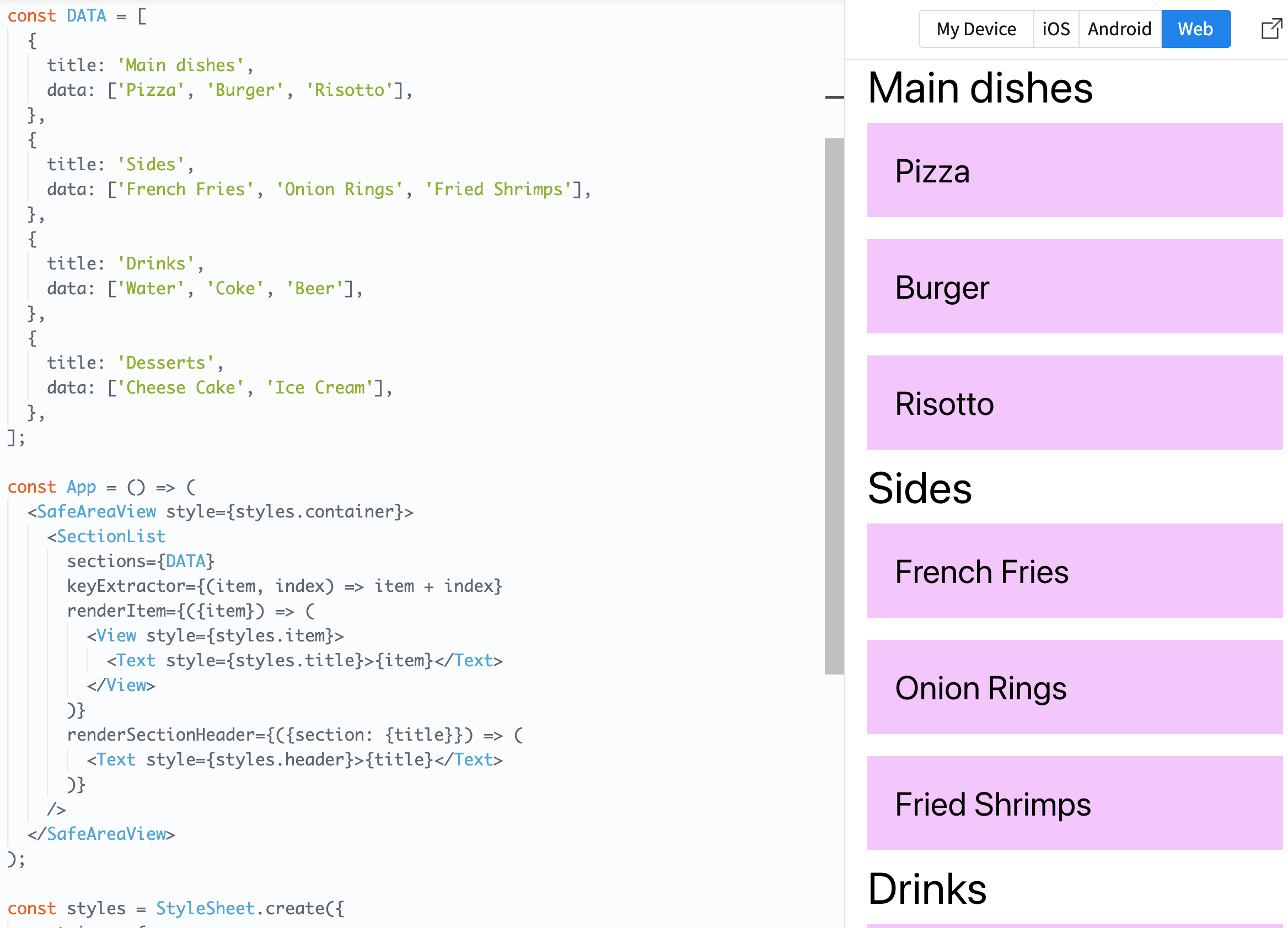
Click on the photo to run the sample code.
This code is an example of using React Native to create a list that displays items grouped by sections. The main components are:
-
Imports
import React from 'react';
import {
  StyleSheet,
  Text,
  View,
  SafeAreaView,
  SectionList,
  StatusBar,
} from 'react-native';
Import the necessary React Native components and modules for the app's construction.
-
DATA Constant
const DATA = [ ... ];This is the data for the items grouped by sections. Each section consists of a
titleanddata, wheredatacontains the items for that section as an array. -
App Component
const App = () => { ... };This is the main component of the app. It uses the
SectionListcomponent to display items from theDATAarray divided by sections.- The
sectionsprop specifies the data to display for each section. - The
keyExtractorprop specifies a function to create a unique key for each item. Here, the key is generated by combining the item's value and its index. - The
renderItemprop defines how each item will be rendered. - The
renderSectionHeaderprop defines how the header for each section will be rendered.
- The
-
Styles
const styles = StyleSheet.create({ ... });This part defines the application's styles. Here, the styles for the container, items, section headers, and item titles are defined.
-
Export
export default App;The
Appcomponent is set as the default export, allowing it to be imported and used in other files.
9. ActivityIndicator
ActivityIndicator is a loading indicator (or spinner) component provided by React Native. It's useful for letting users know that the app is still working while fetching data or during processing.
Key Features
- Platform-Specific Style: By default, the
ActivityIndicatoruses the native loading indicator style of the current platform (iOS or Android). - Customizability: You can customize various properties of the indicator, such as its size and color.
Main props
- size: Sets the size of the indicator. It can take either a string value of 'small' or 'large' or a specific numeric value.
- color: Sets the color of the indicator. This value should be a valid color string (e.g., '#0000ff' or 'blue').
- animating: Determines whether the indicator should spin. The default value is
true.
Usage Example
import React from 'react';
import {ActivityIndicator, StyleSheet, View} from 'react-native';

const App = () => (
  <View style={[styles.container, styles.horizontal]}>
    <ActivityIndicator />
    <ActivityIndicator size="large" />
    <ActivityIndicator size="small" color="#0000ff" />
    <ActivityIndicator size="large" color="#00ff00" />
  </View>
);

const styles = StyleSheet.create({
  container: {
    flex: 1,
    justifyContent: 'center',
  },
  horizontal: {
    flexDirection: 'row',
    justifyContent: 'space-around',
    padding: 10,
  },
});

export default App;
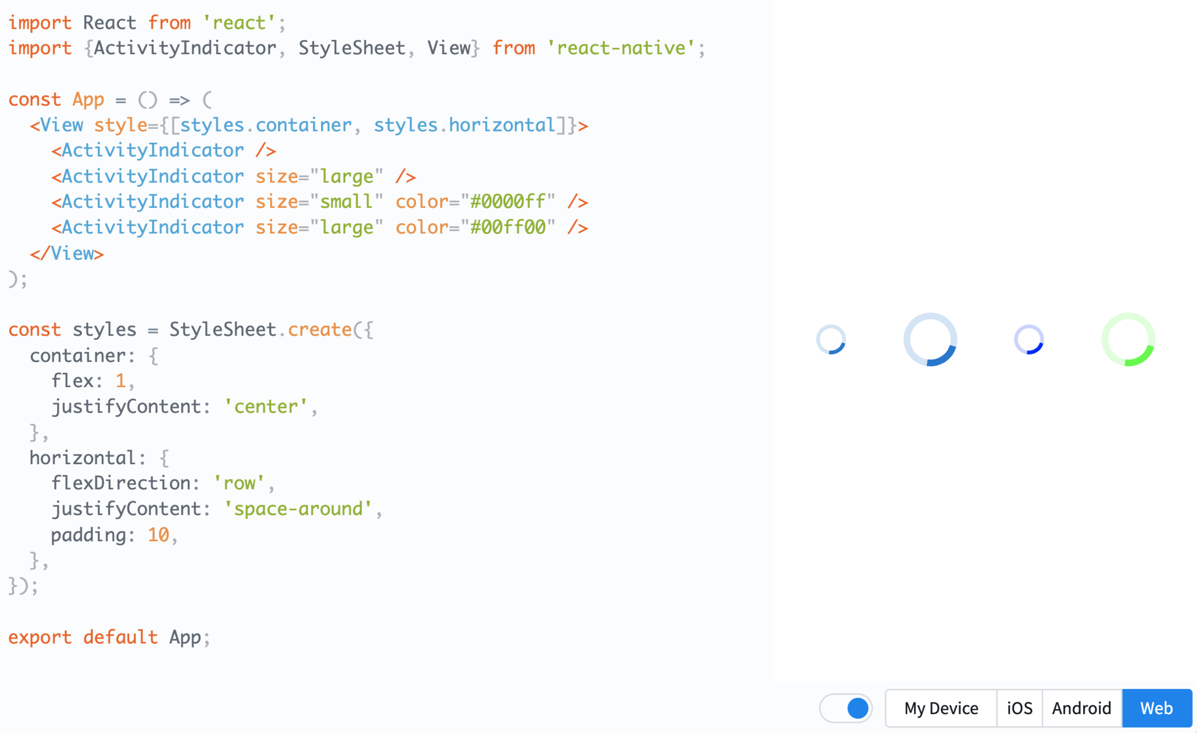
Click on the image to run the example code.
This code demonstrates a React Native application that displays multiple ActivityIndicator components on the screen. The ActivityIndicator is a rotating circular indicator used in apps to notify users of ongoing loading or data processing.
Here's a breakdown of each section:
-
Imports
import React from 'react';
import {ActivityIndicator, StyleSheet, View} from 'react-native';
This section imports the required React Native components and modules for building the app.
-
App Component
const App = () => { ... };This is the main component of the app. Here, four different
ActivityIndicatorcomponents are rendered.- The first and second
ActivityIndicatoronly differ in size. Sizes can be either the default orlarge. - The third and fourth
ActivityIndicatorhave both size and color specified.
- The first and second
-
Styles
const styles = StyleSheet.create({ ... });This section defines the application's styles.
container: Centers the component on the screen.horizontal: Sets the component's orientation to horizontal and evenly spaces components. Padding is added to ensure components aren't too close to the screen edges.
-
Export
export default App;This line sets
Appcomponent as the default export, making it importable in other files.
10. Touchable**
In React Native, various "Touchable" components are provided to handle user touch inputs. These components are used to create a responsive UI when users tap on screen elements. Here, we'll cover TouchableHighlight, TouchableOpacity, and TouchableWithoutFeedback.
TouchableHighlight
- Functionality: A component that offers a brightness change effect when touched by the user.
- Main Features: Upon touch, a specified background color is revealed.
- Key props:
underlayColor: The background color that appears on touch.
TouchableOpacity
- Functionality: A component that provides a transparency change effect when touched.
- Main Features: The transparency of the component decreases upon touch.
- Key props:
activeOpacity: The transparency level applied on touch. The default value is 0.2.
TouchableWithoutFeedback
- Functionality: A component to process touch events without any visual effect.
- Main Features: Typically used alongside custom effects due to its absence of visual feedback.
Each "Touchable" component can be selectively used depending on various situations and requirements. For instance, you might choose TouchableOpacity for rapid visual feedback on touch or TouchableWithoutFeedback when you need additional actions without any touch effect.
Besides these, React Native offers many other built-in components and APIs. Additionally, numerous libraries provided by the community allow for the utilization of extra components or functionalities.
Usage Example
import React, {useState} from 'react';
import {StyleSheet, Text, TouchableHighlight, TouchableOpacity, TouchableWithoutFeedback, View} from 'react-native';

const TouchablesExample = () => {
  const [count, setCount] = useState(0);
  const onPress = () => setCount(count + 1);

  return (
    <View style={styles.container}>
      <TouchableHighlight onPress={onPress}>
        <View style={styles.button}>
          <Text>Highlight Here</Text>
        </View>
      </TouchableHighlight>
      <TouchableOpacity style={styles.button} onPress={onPress}>
        <Text>Opacity Here</Text>
      </TouchableOpacity>
      <TouchableWithoutFeedback onPress={onPress}>
        <View style={styles.button}>
          <Text>WithoutFeedback Here</Text>
        </View>
      </TouchableWithoutFeedback>
      <View style={styles.countContainer}>
        <Text style={styles.countText}>{count || null}</Text>
      </View>
    </View>
  );
};

const styles = StyleSheet.create({
  container: {
    flex: 1,
    justifyContent: 'center',
    paddingHorizontal: 10,
    rowGap: 12,
  },
  button: {
    alignItems: 'center',
    backgroundColor: '#DDDDDD',
    padding: 10,
  },
  countContainer: {
    alignItems: 'center',
    padding: 10,
  },
  countText: {
    color: '#FF00FF',
  },
});

export default TouchablesExample;
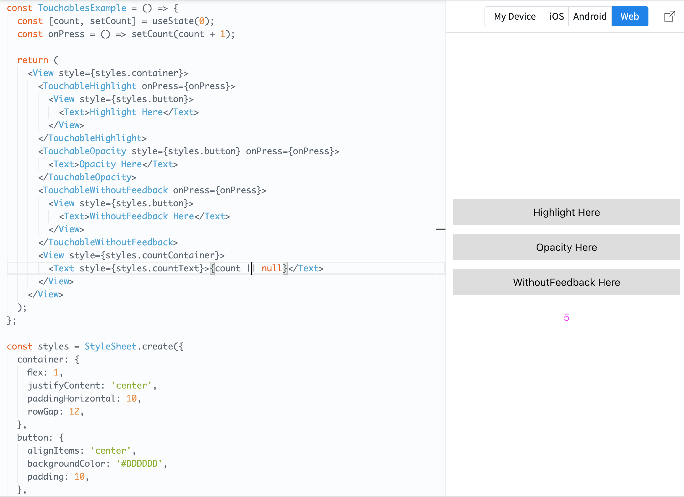
Clicking on the photo allows you to run the example code.
This code demonstrates an application using React Native to display various types of touch-responsive buttons on the screen. Specifically, it utilizes three major touch response components offered by React Native: TouchableHighlight, TouchableOpacity, and TouchableWithoutFeedback.
Breaking down the main sections of the code:
-
Imports Import the necessary components and modules from React Native.
-
State Initialization
const [count, setCount] = useState(0);Create a state variable named
countand a function,setCount, to modify its value. It's initialized to 0. -
onPress Function
const onPress = () => setCount(count + 1);Define a function that gets triggered on button press. This function increments the
countby 1. -
Return Section Return the various touch-responsive components and a section to display the current
countvalue.TouchableHighlight: Shows a bright highlight effect when pressed.TouchableOpacity: Reveals a transparency effect when pressed.TouchableWithoutFeedback: Performs actions when pressed, without any visual effect.
The
onPressfunction is attached to each touch-responsive component so that the counter increments each time a button is pressed. -
Styles Define the styles for the application. Key styles include:
container: Occupies the full screen and centers the inner items.button: Style applied to each touch-responsive component. It has a background color and padding set.countContainer: Styles the section displaying the count.- `
countText`: Styles the count text, setting the text color to purple.
- Export
Set
TouchablesExampleas the default export, making it importable in other files.
Now that we've covered the main components of React Native, you're better equipped to start building diverse and responsive mobile applications. The power of React Native lies in the rich ecosystem and community that supports it. Continue exploring, and don't forget to check out the official React Native documentation for more in-depth knowledge and best practices!
Happy coding! 🚀